

In 2026, digital accessibility is no longer a choice but a legal requirement for a large share of Dutch websites and online stores. The European Accessibility Act has applied since June 28, 2025. Even so, most sites still do not meet it. In this article you will read what the law asks exactly, whether your website falls under it and what you can start on today.
What is digital accessibility?
Digital accessibility means that everyone can use your website, including people with a visual, hearing, motor or cognitive impairment. Think of a visitor using a screen reader, someone who navigates with a keyboard only, or someone who simply cannot read text with low contrast. An accessible website works for all of those visitors, without a separate “accessible version”.
That is not a small audience. According to the European Commission, more than 87 million people in the EU live with some form of disability. Add an aging population to that (eyesight and motor skills decline) and you are talking about a sizable share of your visitors and customers.
More than 87 million people in the EU live with a disability. So digital accessibility is not about an exception, but about a large group of customers your website either can or cannot serve.
The European Accessibility Act in brief
The European Accessibility Act (EAA) is a European directive (Directive (EU) 2019/882) that has applied since June 28, 2025. Where accessibility rules used to be mainly a government matter, the EAA now affects businesses too. The law covers online stores and other forms of e-commerce, banking services, e-books, telecom services and transport tickets, among others.
Two things are important to know. First: the obligation applies to services delivered to consumers. If you sell online to consumers, your online store almost certainly falls under it. Second: there is an exemption for micro-enterprises that provide services, meaning companies with fewer than ten employees and an annual turnover or balance sheet total of no more than two million euros. Grow beyond that and the law applies to you as well.
The practical yardstick behind the law is the Web Content Accessibility Guidelines (WCAG) from the W3C, in practice at level AA. For the Dutch situation, DigiToegankelijk is a good starting point: it holds the official explanation of the standards and obligations.
Digital accessibility in practice: where things often go wrong
The good news: most accessibility problems are not exotic edge cases but recurring issues you can solve in a structured way. These are the categories where websites trip up most often in practice, along with what WCAG asks for each point.
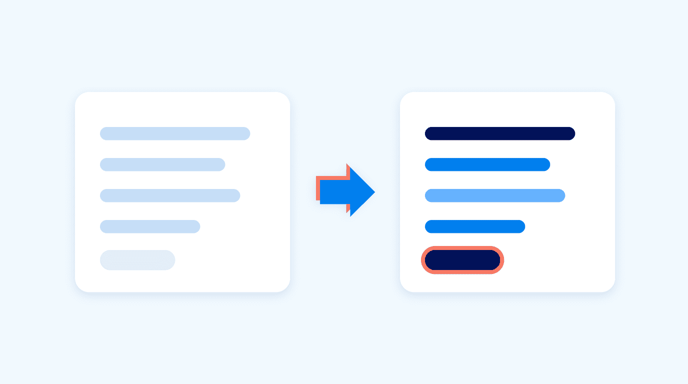
| Common problem | What WCAG (level AA) requires | Who you help with it |
|---|---|---|
| Too little color contrast | A contrast ratio of at least 4.5:1 for normal text | People with low vision, older users, anyone in bright sunlight |
| Images without alt text | Every informative image has a text alternative | Screen reader users (and search engines) |
| Not operable with a keyboard | All functions work without a mouse | People with a motor impairment |
| Forms without labels | Every input field has a clear, linked label | Screen readers and anyone who wants to fill in a form quickly |
| Invisible focus | You can always see which element is selected | Keyboard users |
| Video without captions | Captions for video with spoken content | Deaf and hard of hearing visitors, viewers without sound |
Source: WCAG 2.2, W3C.
What stands out: almost every point in this table also helps visitors without a disability. Good contrast, clear forms and logical navigation are simply good UX. And there is another bonus: many accessibility requirements (semantic HTML, alt text, a clear heading structure) are exactly the things that help search engines and AI assistants understand your site better. You can read how that works in our article on GEO and SEO.
What our own workshop produced
On August 19, 2026, our entire team spent an afternoon together on an internal workshop about the
accessibility guidelines, run by our own designer. Not because a client asked for it,
but because we want every site we deliver to meet them by default. Three insights from
that afternoon are useful outside our agency as well.
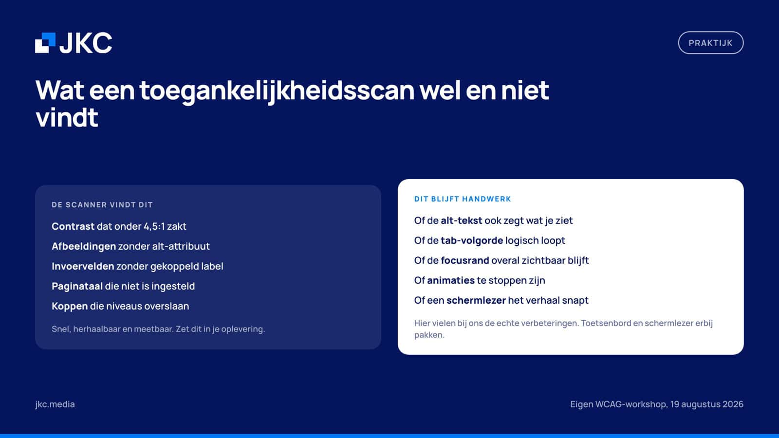
A scan gets you halfway, and no further
We start every check with an automated scan. That works excellently for the
category of errors you can measure objectively: contrast ratios that drop below the standard,
images without an alt attribute, input fields without a linked label, a page where the language
is not set, headings that skip a level. For that we use
Oobee, an open source scanner
you run locally, so you can test a draft site before it goes live.
What a scan like that cannot judge is whether the result actually makes sense. An image with
alt=”image” is technically fine and useless in substance. Whether the tab order runs logically,
whether the focus outline stays visible everywhere, whether a screen reader understands your page as a story: you
only find that out by putting your mouse aside. For us, that is where most of the real
improvements were.
Everything that moves has to be stoppable
This was the most honest outcome of the afternoon: on this point, our own sites did not yet
meet the mark everywhere. Carousels that run automatically, animations on scroll and moving
backgrounds look good, but for people who are sensitive to motion they cause
headaches or nausea. Success criterion 2.2.2 already requires at level A that motion which
runs automatically for longer than five seconds can be paused or stopped. If you want to go further,
criterion 2.3.3 switches off non-essential animation entirely. The practical way to
respect both is the CSS media query prefers-reduced-motion, which reads whether
someone has indicated in their operating system that they want less motion. Since the workshop
we include it by default in new projects.
And that comes with a practical lesson straight away, learned on our own new website. Pausing on
hover sounds neat, but if you take the whole section as the hover area, your cursor is there almost
all the time and in practice the carousel never advances again. Tie the pausing to the
moving element itself and keep the interval short, around eight to ten seconds.
Contrast is a design decision, not a bug
Fixing contrast at the end of a project means changing colors the client has already
approved. That is why we now test it during the design phase, before a single line of code exists.
A recurring example: a dark overlay on a photo to make text readable on
mobile, while the desktop version does not have that same overlay. The text is then readable at one size
and not at the other, and you only notice that during the build. It is better to choose a composition in the design
where the text does not fall over the busy part of the photo, or to simply leave the
photo out there.
Why this matters for your website
Let’s make it concrete. Say you have an online store and the checkout button only works with a mouse, or the error message for an incorrectly filled field is only recognizable by a red border. Then part of your visitors drop out at the most expensive moment of the customer journey: right before the order. You will not see that as a complaint, but you will see it as quiet revenue going to a competitor where ordering does work.
For a growing business owner there is also the business risk to weigh: companies that deliver to consumers must be able to demonstrate that their service is accessible, and regulators can ask for that evidence. For marketing managers in a larger organization there is another angle: buyers and public tenders increasingly ask about accessibility explicitly. Having it in order gives you an edge.
Getting started yourself: three checks you can do today
You do not have to wait for a full audit to get your first insights. Three things you can do yourself, without technical knowledge. One: put your mouse aside and try to navigate your homepage and your contact form with the Tab key. Can you reach everything, and can you always see where you are? Two: set your screen to grayscale and check whether all text and buttons are still readable and recognizable. Three: use an AI assistant to prepare for the real work, for example with this prompt.
I want to assess the digital accessibility of my website in preparation for the European Accessibility Act.

My website: [URL]
My most important pages: [homepage / product page / checkout / contact form]
My audience: [describe your customers]
Number of employees and annual turnover: [fill in, for the micro-enterprise exemption]

Give me:
1. An assessment of whether my organization falls under the EAA and why.
2. The ten most important WCAG 2.2 AA points for this type of website, in plain language.
3. For each point: how I can check for myself whether it is right or wrong.
4. A priority list: what comes first, what can wait.

Important: this is preparation, not legal advice or a formal audit. Ask at most 3 clarifying questions before you start.
Note: an AI analysis like this is good preparation, but not a replacement for a real assessment. Accessibility largely comes down to technology and templates, and that is exactly where you need someone who can look into the code and validate what an automated check misses.
Handling accessibility structurally
At JKC we build and manage websites and online stores for more than 300 organizations, and we include digital accessibility as standard in new projects: semantic templates, brand colors translated with solid contrast, keyboard navigation and forms that work with a screen reader. For existing websites we run an accessibility check with a concrete improvement plan, tied to your SEO and the structure of your website, so one round of improvements scores on several boards at once.
Who does the European Accessibility Act apply to?
The EAA applies to companies that deliver certain products and services to consumers in the EU, including e-commerce, banking services, e-books and telecom. If you sell online to consumers, your online store generally falls under it. There is one important exemption: micro-enterprises that provide services, with fewer than ten employees and no more than two million euros in annual turnover or balance sheet total, are exempt. Purely business (B2B) services fall outside the core obligation, but large business clients increasingly set accessibility as a requirement themselves.
What is the difference between WCAG and the EAA?
The EAA is the law, WCAG is the yardstick. The European Accessibility Act describes which products and services have to be accessible, but does not prescribe technical criteria. In practice, accessibility is tested against the Web Content Accessibility Guidelines from the W3C, usually at level AA. If you meet WCAG 2.1 or 2.2 level AA, you are in good shape for the web part of the EAA. WCAG consists of concrete, verifiable criteria, from color contrast to keyboard operation, which means you can actually steer on it.
Is an accessibility widget or overlay enough?
No. A widget like that (a button that raises contrast or enlarges text) does not solve the underlying problems in your code. A screen reader still trips over missing labels and a keyboard user still gets stuck in a menu that only works on hover. Accessibility experts and advocacy organizations have been warning for years that overlays create a false sense of security. Real accessibility lives in your templates, your content and your forms, and that is exactly what the WCAG criteria test.
What does it cost to make my website accessible?
That depends mainly on the state of your current website. If your site runs on clean, modern templates, it usually comes down to targeted improvements: contrast, alt text, form labels and focus styles. That is manageable work. If your site is older or heavily custom built without regard for semantics, rebuilding templates can be wiser than endless patching. So always start with a check that maps and prioritizes the problems, then you know where you stand before you free up budget.
Can you test accessibility automatically?
Partly. An automated scan reliably finds the measurable errors: contrast that is too low,
missing alt attributes, input fields without a label, a missing language setting. Research
and our own experience point in the same direction: that covers roughly half of the
criteria. The other half needs a person who walks through the site with a keyboard, follows the
focus and listens along with a screen reader. So use the scan as a fixed baseline in your
delivery and plan a manual check alongside it.
Want to know where your website stands on digital accessibility? Get in touch for an accessibility check, and you will get a clear picture of what is already in good shape and what needs to be sorted before the next deadline.
Rather hand it off? See how we help with WordPress maintenance and support and UI/UX design.
More articles
- What does a website cost? More about prices, tips and options 1 July 2024
- Website development costs, comparisons and tips 17 December 2018
- iDEAL is disappearing: what you need to know 29 August 2024