

In our previous blog “4 powerful web design trends for 2026 you need to know today” we already hinted at it: over the coming years accessibility will no longer be an optional extra, but a hard requirement. And that is because of the European Accessibility Act (EAA).
More and more companies ask us: “What does that mean for my site? Do I have to change anything?” Short answer: yes, certainly if you want to take your digital future seriously. And we have good news: a few relatively simple changes already get you a long way.
Who is this blog for?
This blog is for anyone who wants to make their website future proof. Whether you are a company that will have a new site built soon, an organization with an existing website that could use an update, or simply an enthusiastic reader who likes to keep up with the latest trends and legislation around web design, you are in the right place.
What is the European Accessibility Act?
The EAA is European legislation stating that digital services such as websites, web shops and apps have to be accessible to everyone. So also to people with impaired vision, impaired hearing or reduced mobility.
The guidelines are based on WCAG 2.1 (Web Content Accessibility Guidelines). These are the key milestones for the European Accessibility Act: in 2025 companies had to comply with the rules, June 28, 2025 was the deadline, and from 2026 onward it is actively enforced.
What do you have to change to comply?
Below you will find the list of the most important points that you, as a small or medium-sized business owner, definitely need to check.
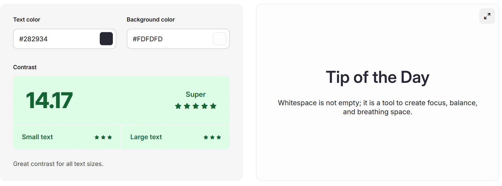
1. Color contrast: at least 4.5:1
Your design can be fancy, but text does have to be readable on every screen. Light gray on white? Unfortunately, that does not meet the European Accessibility Act. The standard is a contrast ratio of at least 4.5:1. This improves both accessibility and visibility on mobile.
That is not a pointless rule, but a hard requirement for better readability. Good contrast does not only make your site more accessible, it makes it more user-friendly for everyone.
Note: color contrast rules apply mainly to text and buttons that serve a function. They do not apply to logos and decorative images.
2. Font size: at least 14pt or 16px
Tiny type is a thing of the past. WCAG prescribes a minimum level of readability, so that everyone can follow your content without effort. Are you using less than 16px for regular text? Then it is time to scale up. What may just about work on desktop is often unreadable on mobile.
Note: font size guidelines apply mainly to text and buttons that serve a function. They do not apply to logos and decorative images.
3. Alt text for images
Screen readers use alt text to describe images to blind and visually impaired visitors. This is not only an obligation, it also gives your SEO a boost. Search engines get a better understanding of what is on your site, and that helps your findability.
Note: alt text is not a place for empty keywords, but a short, clear description of what the image shows. Think: “woman typing on a laptop in an office space” instead of “image homepage JKC Media”.
4. Keyboard navigation and structure
Not everyone uses a mouse to operate a website. So make sure your site can also be navigated properly with the keyboard. Can a visitor tab through the page smoothly? Is it always clear where the focus is? And can forms be filled in completely without a mouse? Think of skip links, clear focus styles and a logical tab order.
5. Clear structure and forms
Use clear headings (H1, H2), enough white space and accessible forms. That helps visitors find the right information quickly and prevents confusion. Screen readers benefit from a clear structure too. A contact form that does not work without a mouse? That is not WCAG proof.
Conclusion
Accessibility is no longer a nice-to-have, but a must. The European Accessibility Act sets clear requirements for websites and digital services. Think of sufficient color contrast, readable text, alt text for images and a site that works well without a mouse.
We are now at the end of 2025. That means it is really time to get your website in order. From June 2025 onward companies have to comply with the guidelines, and in 2026 this will be actively enforced.
For small and medium-sized businesses, this is the moment to check whether their site is ready for these obligations. It does not have to be a big or complicated project, as long as you know what to look out for. At JKC we take our responsibility here: we proactively contact clients to make sure their websites meet the accessibility requirements.
Not sure whether your site complies? Get in touch with us here and let’s take a look together.
Rather hand it off? See how we help with WordPress maintenance and support and UI/UX design.
More articles
- 4 powerful web design trends for 2026 you should know today 10 November 2025
- Content that delivers results in 2026 12 January 2026
- 3 essential SEO trends for more visibility in the AI era 10 November 2025