
What often plays out
-
A collection that deserves to be shown and sits on the site as a page of text.
-
Bookings that run through an email thread, so a quiet Tuesday morning and a school group end up in the same inbox.
-
Time slots and capacity that have to be managed but cannot be managed by hand.
-
A small team, often one editor, who has to keep everything current.
Your collection sets the bar, and your website has to clear it
We design around the collection. The pieces are the images, the type stays out of the way, and the reading order runs from what there is to see to the reason to come. See web design and websites.
Behind it sits the booking, built into the site instead of bolted onto it. Tickets booked and paid for on the page, time slots with their own capacity so a school group cannot fill a quiet morning, and the reservation landing in your own system. See web applications.
And one editor can run all of it, because that is usually the honest size of the team.
Client example
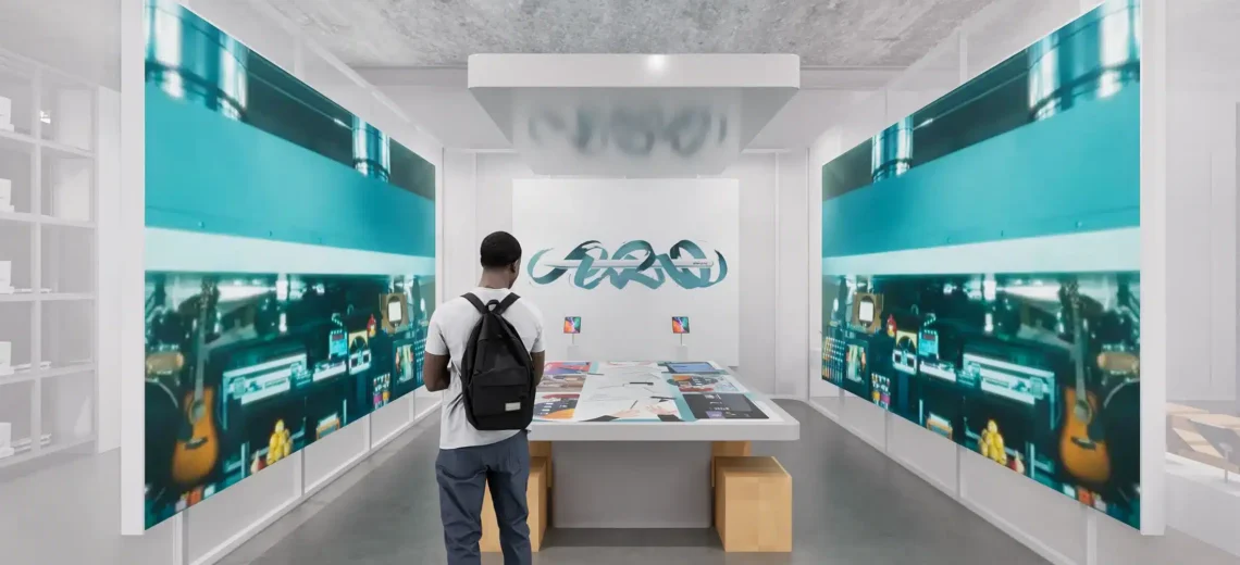
Like at Apple Museum in Utrecht, where the collection became a browsable archive instead of a page of text, tickets are booked and paid for on the site, time slots carry their own capacity, and the bookings arrive in the museum’s own system instead of in an email thread.
Cases in Museum
-
Apple Museum: pixel-perfect design for an iconic experience