

Why is it so important to adapt your website to mobile users? Because a huge number of people now search the internet on their smartphone. In the past, as a consumer you would leaf through a flyer or walk the shopping streets when you were looking for something. That picture has (often) not been accurate for a long time. Consumers are online, on their phones. Research by data company AC Nielson, commissioned by Google, shows that consumers spend 15 hours a week searching for information on their mobile phone (Mobile Path to Purchase: Five Key Findings, November 2013).
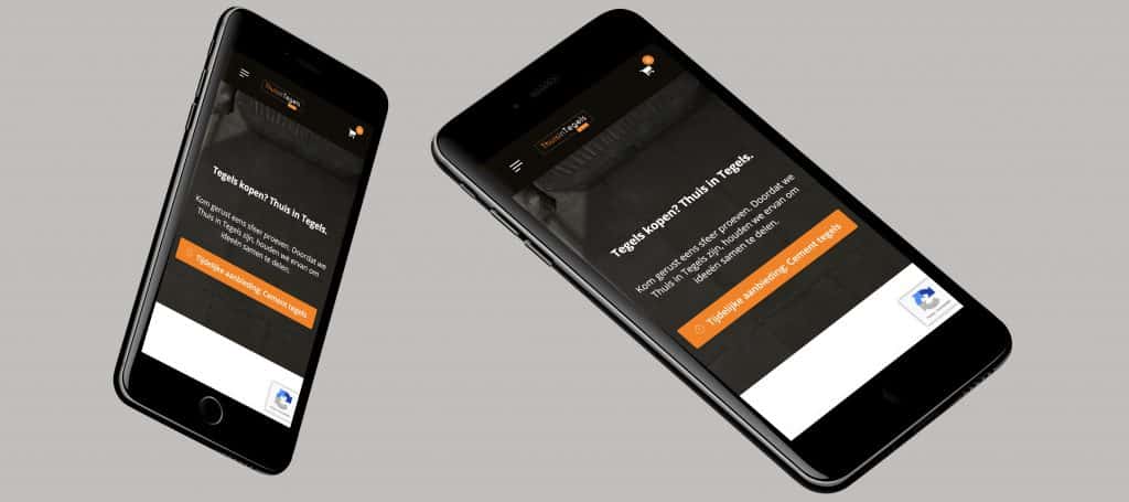
Mobile friendly website
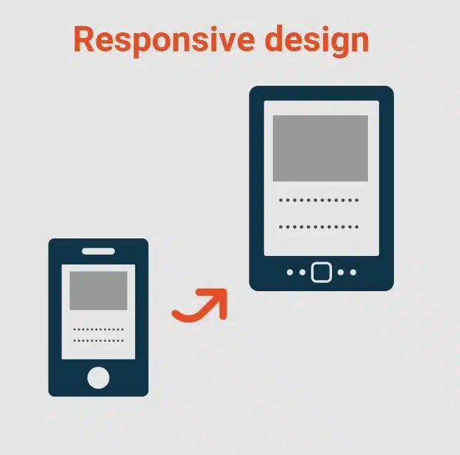
So for you as a website owner it is smart to pay more attention to the mobile version of your website. Research by research agency Ruigrok NetPanel shows that in 2020 half of the Dutch population bought things through their smartphone (What’s Happening Online in 2020?, June 2020). That is why it matters to make your website responsive. What does it mean exactly when your website is responsive? It means your website adapts to the screen the visitor uses to view your site, for example a desktop monitor, a tablet or a phone. By putting real effort into responsive web design, you make your website more mobile friendly.
Flexible design
So how do you do that exactly? There are several ways to make a website mobile friendly. The first is responsive design. The site then automatically adapts to the dimensions of the screen the visitor is looking at, so a flexible design. For that you need the CSS stylesheet of your website, where you can set style rules for things like the different screen sizes. A second option is to build different versions of your website, so visitors on their phone get different information than visitors on a laptop. That is called adaptive design. You then take the device into account, not just the screen size the page is viewed on. This option often means more work, but it does deliver the best user experience for users. They find different content on different devices and their information needs are met in the best possible way.
Mobile-Friendly test
You can test how mobile friendly your website is with Google’s so called ‘Mobile-Friendly Test’. The test looks at how easily visitors can use a page on their smartphone. The tool also flags errors around mobile usability. Our homepage, for example, is rated suitable for mobile devices by the test. Would you like to start making your own website mobile friendly? We are happy to help. Whether it is a completely new website or a refresh of your old one, take a look at our site to see how we can support you.
Would you like help making your website responsive?
On the websites we develop, we always pay a lot of attention to making the site mobile friendly. We are happy to help you with that too. You can find more information on our website, or ask us about the options for a responsive design for your website.
Rather hand it off? See how we help with having a website built and UI/UX design.
More articles
- ChatGPT for your website’s SEO copy: the benefits and the pitfalls 24 January 2023
- Setting up a website: how to prepare properly 21 February 2023
- 5 tips for generating leads on your website 19 July 2023